Implement v-model in Vue.js
Janne Kemppainen |In Vue, the v-model directive is used to create a binding between an input or a component, and a data reference. This makes it possible to update the state of a value that is passed to a component. But how can you implement it yourself, especially if the value needs to be passed through a nested component?
You might also be interested in my earlier post Create a Web App with Vue 3, Tailwind CSS and Storybook.
The v-model API from a user’s perspective
Using a component that implements the v-model directive is simple. You only need to pass the variable reference through the v-model attribute, and the state will be kept in sync automatically.
Here’s an example that uses a checkbox input:
<template>
  <div>
    <input type="checkbox" id="myCheckbox" v-model="checked">
    <label for="myCheckbox">{{ checked }}</label>
  </div>
</template>

<script setup>
import { ref } from 'vue'
const checked = ref(true)
</script>
When you check and uncheck the box the text label changes between true and false. Couldn’t get much simpler than that!
Implementing v-model for a custom component
It’s more efficient to create a reusable component for checkboxes instead of repeating the same code throughout the application, especially when styling is involved.
However, this also means that we need to pass the checkbox value from outside of the component. By default, v-model uses a prop called modelValue and a custom event update:modelValue when the value changes. Our component needs to connect the incoming prop to the <input> element and emit the value of the input event.
Let’s translate this to a Vue component:
<template>
  <div>
    <input
      type="checkbox"
      id="myCheckbox"
      :checked="modelValue"
      @input="$emit('update:modelValue', $event.target.checked)"
    >
    <label for="myCheckbox">{{ modelValue }}</label>
  </div>
</template>

<script setup>
defineProps(['modelValue'])
defineEmits(["update:modelValue"])
</script>
The component’s setup script only has one prop and one emit. We can’t use v-model to directly connect the modelValue prop to the input element since prop bindings are not editable. Instead, we need to connect the modelValue prop to the checked attribute and have the input event emit the checked state as update:modelValue.
The model value can be used in the component’s template to display the current state.
Now the component can be used in an application:
<script setup>
import { ref } from 'vue'
import FormCheckbox from './FormCheckbox.vue'
const checked = ref(true)
</script>

<template>
  <FormCheckbox v-model="checked"></FormCheckbox>
</template>
If you’re using TypeScript you’ll have to type cast the event target before you can access the value itself:
@input="$emit('update:modelValue', ($event.target as HTMLInputElement).checked)"
Nesting v-model
When implementing v-model, it’s important to keep in mind that the v-model directive works by passing the value and event between the parent and child components. When working with a nested component structure, the v-model binding needs to be repeated in all middle layers to ensure that the value is passed correctly.
One scenario where this can come up is when working with Headless UI, which is an unstyled UI framework. It contains logic for menus, listboxes, switches, dialogs, etc. but leaves the styling up to the developer. These components accept a v-model binding, and if a custom styled component is needed, necessary model values and emits must be passed around to make it all work.
This example is a toggle component that wraps switch from Headless UI. It’s adapted from the basic example in the switch documentation and uses Tailwind CSS for styling. My previous post Create a Web App with Vue 3, Tailwind CSS and Storybook covers setting up Tailwind CSS with Vue.
Naturally, this example also requires the @headlessui/vue package to work.
<template>
  <Switch
    :modelValue="modelValue"
    @update:modelValue="$emit('update:modelValue', $event)"
    :class="modelValue ? 'bg-blue-600' : 'bg-gray-200'"
    class="relative inline-flex h-6 w-11 items-center rounded-full"
  >
    <span class="sr-only">{{ description }}</span>
    <span
      :class="modelValue ? 'translate-x-6' : 'translate-x-1'"
      class="inline-block h-4 w-4 transform rounded-full bg-white transition"
    />
  </Switch>
</template>

<script setup>
import { Switch } from "@headlessui/vue";
defineProps(["modelValue", "description"]);
defineEmits(["update:modelValue"]);
</script>
Note how instead of using the v-model directive for the Switch component you must manually pass your own modelValue prop and bind the update event. In this case, the event already contains the needed value, so it can be returned directly.
I’ve copied the styling from the example in the documentation but here modelValue is used in place of the internal ref enabled to set the UI state.
Since Headless UI places a strong emphasis on accessibility, I’ve included the screen reader description from the example and made it configurable via a property.
Here’s a simple app that uses the toggle to display a different text based on the toggle status.
<script setup>
import { ref } from "vue";
import FormToggle from "./FormToggle.vue";
const toggled = ref(true);
</script>

<template>
  <main class="container mx-auto">
    <div class="mt-4 mx-4">
      <FormToggle v-model="toggled" description="My toggle" />
      <p v-if="toggled">Toggle is on</p>
      <p v-else>Toggle is off</p>
    </div>
  </main>
</template>
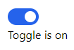
And this is how the toggle looks in action!
Using multiple v-models
Multiple v-model definitions can be used, each with its own name, to bind multiple data values in a complex component.
One such use case could be a reusable sign-in UI component, where separating the UI from the logic makes it more reusable and flexible. This separation is especially useful when you’re building a component library with Storybook.js, as it allows for easy testing and documentation of the components.
Here’s the example sign-in component. I have highlighted the important lines.
<template>
  <div class="container mt-4">
    <h1 class="text-xl font-bold mb-2">Sign In</h1>
    <label class="block font-bold mb-1" for="username">Username</label>
    <input
      id="username"
      type="text"
      class="border px-2 py-1 rounded"
      :value="username"
      @input="$emit('update:username', $event.target.value)"
    />
    <label class="block font-bold mb-1" for="password">Password</label>
    <input
      id="password"
      type="password"
      class="border px-2 py-1 rounded"
      :value="password"
      @input="$emit('update:password', $event.target.value)"
    />
    <div class="mt-4">
      <button
        class="
          bg-blue-500
          hover:bg-blue-700
          text-white
          font-bold
          py-2
          px-4
          rounded
        "
      >
        Sign In
      </button>
    </div>
  </div>
</template>
<script setup>
defineProps(["username", "password"]);
defineEmits(["update:username", "update:password"]);
</script>
Instead of using the default modelValue name, the props are defined as username and password in the script setup. Similarly, emits are defined for both of these props. With this configuration, the component does not have a default v-model binding.
The implementation is similar to the custom component example, but the prop and emit names are different. The emitted event value is also different since a text input control uses $event.target.value instead of the checked property that was used with the checkbox example.
For the sake of this example I’ve left out the button event handling logic.
Now let’s use the component in an application.
<script setup>
import { ref } from "vue";
import SigninForm from "./SigninForm.vue";
const username = ref("");
const password = ref("");
</script>

<template>
  <main class="container mx-auto">
    <SigninForm v-model:username="username" v-model:password="password" />
    <p>Username is "{{ username }}"</p>
    <p>Password is "{{ password }}"</p>
  </main>
</template>
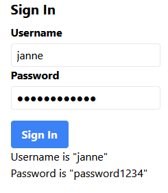
The named reference bindings are v-model:username and v-model:password. When the form values are updated the changes are also reflected in the paragraphs that show the values.
This is how the page looks:
It really is that easy.
Conclusion
In this article we took a look at the Vue v-model and implemented it a few times in different contexts. Hopefully this post gave you the confidence to start your own creations!
Previous post
Combine Multiple Filter Conditions in Python