Hugo Single Page Templates
Janne Kemppainen |Now that our blog has a basic single post template it is time to move on to other content pages. In this post we will concentrate on pages such as About, Privacy Policy and Contact.
Even though the site itself is static it is possible to embed dynamic content from other sources. For example, the contact page will show you how to embed Google Forms as a contact form and a map showing your office location.
I assume that you are continuing from the situation in the previous posts and have the Hugo development server running locally.
General page template
If you check the layouts/_default/single.html file inside your theme you’ll see that it is still empty. This is the file that Hugo will fall back to if it can’t find anything more suitable for a single page. Now, because it doesn’t contain the main-block Hugo won’t be able to render single pages.
Let’s fix this by defining a simple main block inside the template file.
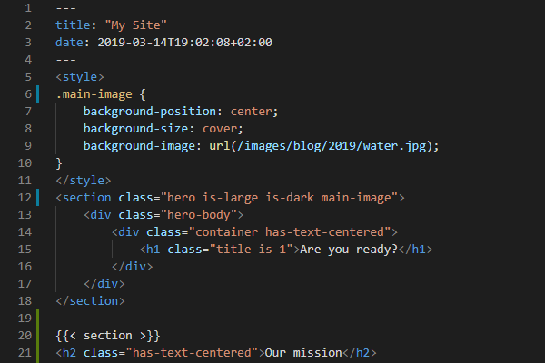
{{ define "main" }}
<section class="section">
    <div class="container max-800px">
        <h1 class="title is-3">
            {{ .Title }}
        </h1>
        <div class="content">
            {{ .Content }}
        </div>
    </div>
</section>
{{ end }}
Now all single pages will default to this simple layout. Here I used the max-800px class that was defined in the previous blog post of this series to limit the width of the content.
The About page
About is the page where your users can see what your site is about, who it is for, what value do you give your readers, etc. It is the page where people go to when they want to know more about your website.
Create the about page Markdown file by running the following Hugo command at the root of your project:
>> hugo new about.mdOpen the created file content/about.md in an editor and remove the draft: true line so that the page will actually be published when you go live. Add some Markdown content and go to http://localhost:1313/about/ to see how it looks.
Create a custom template
Let’s create a custom template for the about page so that we don’t use the default one. Create a new template file layouts/_default/about.html inside the theme. Add an empty define “main” block to start with.
This isn’t enough to make hugo use the new layout file yet. You need to set the desired layout explicitly in the front matter by adding the following line in the about.md file
layout: aboutThe existing page content should disappear as there is the template file we are now using doesn’t have any markup yet.
I’m thinking about creating a full height hero image with the page title with the rest of the content being below the fold. I will be using this photo from pexels.com. I’ve cropped the image a bit as shown below to have a better fit on all browser sizes.

Placeholder image for the About page
As always, start by defining the main block.
{{ define "main" }}

{{ end }}
Add the hero element
Bulma has the Hero element that we can use to display the full height background image with the page title. The hero element is especially handy as it can take into account the height of the navbar so that the hero block ends at the bottom edge of the browser window.
So let’s start by defining the hero element:
{{ define "main" }}
<div class="hero is-dark is-fullheight-with-navbar" {{ with .Params.heroimage }}
    style="background: url({{ . }}) center top; background-size:cover;" {{ end }}>
    <div class="hero-body">
    </div>
</div>
{{ end }}
Here we added two divs to the page. The first one is the Hero element as it has the hero class. The is-dark changes the background color to dark gray and the is-fullheight-with-navbar does exactly what you’d expect; it sets the div height equal to the viewport height minus navbar height.
Next there is some Hugo templating to set the background image. Because modifying CSS on the fly is really not an option as CSS files are stored in the static directory I’m using inline styles to set images that I want to be defined from the page front matter.
In this case Hugo will search for the heroimage parameter in the front matter and only if it is found will it set the inline style. As within the with clause the image parameter is the current context we can use dot to place it inside the url() CSS function. The image is also vertically centered and horizontally top aligned. The background-size setting makes the image cover the whole area even if the image aspect ratio doesn’t match the browser window.
Right now the hero block is all gray as we haven’t defined the heroimage parameter yet. Download my example image or use your own and save it to the static/images directory of your website. Now reference that image by adding the following line to the front matter of about.md:
heroimage: /images/author.jpgThe background image of the rendered About page should change. Now you can also add some test content such as headings and text to the Markdown file so that you have something ready when we add the content part.
Hero content
The hero block contains the hero-body element which has the main content of the block. This is where we will put the page title and a custom text block if you so desire. Make the hero body look like this:
<div class="hero-body">
    <div class="container max-800px">
        <h1 class="title is-1 has-background-primary narrow-background">
            {{ .Title }}
        </h1>
        {{ with .Params.herotext }}
        <h2 class="title subtitle is-4 has-background-primary narrow-background">
            {{ . }}
        </h2>
        {{ end }}
    </div>
</div>
The first thing inside is a container div where we also used the max-800px class which limits the width of the content to 800 pixels. We defined this helper class in the previous post so go check that out if you don’t yet have it.
Next we add the page title from the front matter with a large font size and using the primary background color of Bulma.
There is also a new helper class narrow-background which you should add to the style.css file:
.narrow-background {
    display: table;
    padding: 0.1em;
}
Without this helper class the title would expand to the full width of the parent container which would look ugly with the background color. The display: table fixes this by making the title element take only the space that it requires. The small padding gives just a tiny bit of headroom so that the background doesn’t start from the edges of the letters.
The second title is a smaller one and it is optional. The with block looks for a parameter herotext in the front matter and adds it as the subtitle if found. You can add some motto or other motivational text here to summarize what your site is about.
Page content
Finally, add the actual content after the hero div:
<div class="section">
    <div class="container max-800px">
        <div class="content">
            {{ .Content }}
        </div>
    </div>
</div>
This uses the same max-800px class so that the user experience is the same as with the blog posts.
I’m using the following front matter in the blog.md front matter.
---
title: "About Me"
date: 2019-04-26T20:18:54+03:00
heroimage: /images/author.jpg
herotext: Helping you succeed in life
layout: about
---
And the actual rendered page looks like this:
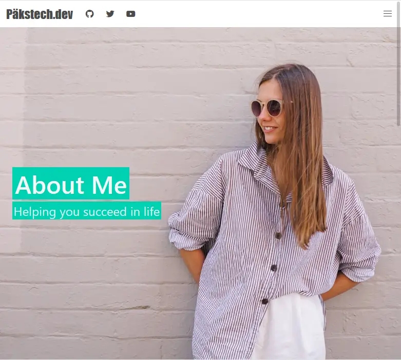
About page example
Note that you can compile the Bulma styles with custom colors so you can actually change the primary background color later.
Privacy policy
Next, let’s create the privacy policy for your site. There are many online privacy policy generators available so choose the one you like to create your own policy. Usually they will not provide the result in Markdown format so you’ll have to either convert the text manually, or you can use the HTML directly.
There is also a privacy notice template available from the EU GDPR website that you can modify to suit your needs.
Create the privacy page with Hugo
>> hugo new privacy.mdOpen the generated file and change the title to “Privacy Policy” in the front matter. Add your policy text and save the file.
If you now navigate to the privacy page at http://localhost:1313/privacy you’ll see that the page used the default layout for single pages which actually looks ok for this kind of text-only page.
Contact page
The last part of this post is to create a page where your visitors can contact you. Contact pages can have a wide variety of information so what I’m showing here should be considered as inspiration and adjusted as needed.
Layout
The first thing we should do is create a new template for the contact page so create the required template file layouts/_defaults/contact.html and define the main block
{{ define "main" }}
{{ end }}
Next create the actual content file:
>> hugo new contact.mdEdit the front matter to use the correct layout and remove the draft line. You can also change the page title.
---
title: "Contact us"
date: 2019-04-29T11:58:46+03:00
layout: contact
---
Open the site configuration file config.toml and add the contact page to the navbar or footer.
[[menu.main]]
    name = "Contact"
    url = "/contact"
Now the site visitors have a way to navigate to the contact page.
Let’s use a bit similar layout as we did with the about page but this time let’s not use a full height hero image. I’ll be using the image below as the hero background.

Placeholder image for the Contact page
First add the code below to the template file to create the hero element. It is using the same trick as with the About page for the background image but this time the image is centered in both directions. The page title is also contained inside the hero head so it is located at the top of the hero element. This works better for the image that I selected as the people are not obscured by the text. Feel free to move it inside the hero-body block which I left empty in this case.
<div class="hero is-dark is-medium" {{ with .Params.heroimage }}
    style="background: url({{ . }}) center center; background-size:cover;" {{ end }}>
    <div class="hero-head">
        <div class="container">
            <h1 class="title is-2 has-background-primary narrow-background">
                {{ .Title }}
            </h1>
            {{ with .Params.herotext }}
            <h2 class="title subtitle is-4 has-background-primary narrow-background">
                {{ . }}
            </h2>
            {{ end }}
        </div>
    </div>
    <div class="hero-body"></div>
</div>
Next, add the following block of code after the hero-body div inside the hero block.
<div class="hero-foot">
    {{ with .Params.buttons }}
    <nav class="tabs">
        <div class="container">
            <ul>
                {{ range . }}
                <li>
                    <a class="has-background-primary" {{ with .id }}id="{{ . }}" {{ end }}
                        {{ with .href }}href="{{ . | safeURL }}" {{ end }}>
                        <span class="icon"><i class="{{ .icon }}" aria-hidden="true"></i></span>
                        <span>{{ .name }}</span>
                    </a>
                </li>
                {{ end }}
            </ul>
        </div>
    </nav>
    {{ end }}
</div>
This places content at the bottom part of the hero element, the hero footer, if the page has a parameter called buttons defined. This is a list of dictionaries that have at least a name and an icon but which can also specify the href or the id.
If buttons is defined then a list of tabs is added to the page according to the parameters.
Below are some example values that you can use in your front matter to try out. The first one is for adding a phone link that starts a call to your phone number and the second one is for opening a contact form that we will define later in this post. Notice the safeURL function in the template which allows us to add the tel: part to the href.
buttons:
- name: Phone
  icon: fas fa-phone
  href: "tel:555555555"
- name: Contact form
  icon: fas fa-envelope
  id: open-modal
The Bulma tabs are not responsive on mobile devices so let’s add some CSS that remove the text on smaller screens and only shows the icons. As these modifications are specific to this page you can add the CSS inside the template file with <style> tags.
<style>
    @media screen and (max-width: 768px) {
        li>a>span:not(.icon) {
            visibility: hidden;
            position: absolute;
        }
        nav.tabs li {
            -webkit-box-flex: 0;
            -ms-flex-positive: 0;
            flex-grow: 0;
            -ms-flex-negative: 1;
            flex-shrink: 1;
        }
        .tabs .icon {
            margin-left: 0.5em;
        }
    }
</style>
Page content and maps
Add a new section after the hero element and inside it a container for the main content of the site. This time we wont be limiting the page width to 800 pixels.
The code below has the content block that we are already used to having on our pages but in addition to it there is also a conditional block that is added if a parameter called map is defined. This block adds an embedded Google Maps iframe to a column that takes one third of the available space, leaving two thirds for the content block.
<div class="section">
<div class="container">
<div class="columns">
<div class="column">
<div class="content">
{{ .Content }}
</div>
</div>
{{ with .Params.map }}
<div class="column is-one-third">
<div class="map-responsive">
<iframe
src="https://maps.google.com/maps?hl=en&q={{ . | htmlEscape }}&ie=UTF8&t=&z=15&iwloc=B&output=embed"
frameborder="0" scrolling="no" marginheight="0" marginwidth="0"></iframe>
</div>
</div>
{{ end }}
</div>
</div>
</div>I modified the idea from this page to generate a responsive Google Maps embed code. As the styling is specific to this page only you can add the following CSS inside <style> tags on the page template.
    .map-responsive {
        overflow: hidden;
        padding-bottom: 100%;
        position: relative;
        height: 0;
    }

    .map-responsive iframe {
        left: 0;
        top: 0;
        height: 100%;
        width: 100%;
        position: absolute;
    }
What’s neat about this solution is that you only need to specify the address or other place in the front matter of the page as normal text and the Hugo block will actually change it to a HTML query with the htmlEscape function. For example, to set the map to the Helsinki central library Oodi the following line is enough:
map: Oodi, HelsinkiRemember that you can add pure HTML to the Markdown files as well. Here is a mix and match of some example content for your contact page. You can modify it as needed.
<div class="columns is-multiline is-mobile">
    <div class="column">
        <h2 class="title is-4">Opening hours</h2>
        <p>Mon-Fri: 10:00-20:00<br>
        Sat: 10:00-18:00<br>
        Sun: closed</p>
    </div>
    <div class="column">
        <h2 class="title is-4">Address</h2>
        <p>My Company <br>Töölönlahdenkatu 4 <br>00100 Helsinki<br>Finland</p>
    </div>
</div>

### Our services
- We can do this
- We can do that
- We can do anything
And here is how the final result looks like.
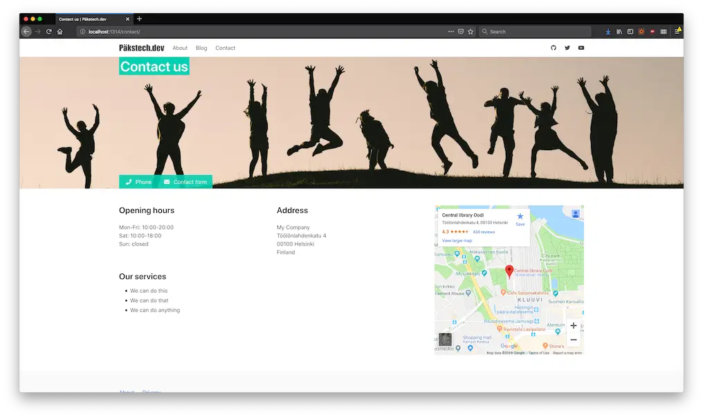
Contact page layout rendered on browser
And on mobile:
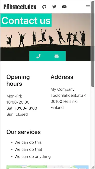
Contact page layout on a mobile resolution
As you can see the call and message buttons have changed to show only the icons to preserve space.
Contact form
Because our site doesn’t have an active server we can’t really utilize a traditional contact form. However, we can use external services such as Google Forms for this kind of dynamic functionality. (Note that we could use Netlify forms but I’m keeping this part of the tutorial more general.)
We already added the contact form open button with the id open-modal by defining it in the front matter. Now it’s time to put it to use. Here is the full code to embed a modal Google Form to your page:
{{ with .Params.form }}
<style>
    .contact-form {
        width: 640px;
        height: 960px;
        overflow: scroll;
    }
</style>
<div class="modal">
    <div class="modal-background"></div>
    <div class="modal-content" style="overflow: auto!important; -webkit-overflow-scrolling: touch!important;">
        <iframe class="contact-form" src="{{ . }}" width="640" height="1019" frameborder="0" marginheight="0"
            marginwidth="0">Loading...</iframe>
    </div>
    <button class="modal-close is-large" aria-label="close"></button>
</div>
<script>
    document.querySelector('a#open-modal').addEventListener('click', function (event) {
        event.preventDefault();
        var modal = document.querySelector('.modal');
        var html = document.querySelector('html');
        modal.classList.add('is-active');
        html.classList.add('is-clipped');

        var close = (e) => {
            e.preventDefault();
            modal.classList.remove('is-active');
            html.classList.remove('is-clipped');
        }
        modal.querySelector('.modal-background').addEventListener('click', close);
        modal.querySelector('.modal-close').addEventListener('click', close);
    });
</script>
{{ end }}
The only thing you need to add to the Markdown file is to add a string form that defines the embed link to your contact form.
form: https://docs.google.com/forms/d/e/1FAIpQLScJu093Bj9AS6ryW9KWgrbMx6vYZF2dxk_vlboINkKqfRU83A/viewform?embedded=trueYou can get this from the Google Forms page after creating a form by clicking SEND and selecting the embed option. Then, instead of copying the full embed code just select the URL from the src attribute and paste it to the front matter as above.
The code is split in three parts: style, Bulma modal and a jQuery script. All of this is added only if the form parameter has been set in the front matter. The style part makes the embedded iframe show properly on the page as without this only a part of the embedded form would be visible without scrolling.
The HTML part uses the Bulma modal to create a new modal element. The modal-background div represents the dark gray background overlay and the modal-content has the actual content at the front. It then contains the embedded iframe from Google Forms. There is also a button to close the modal form which is placed in the top right corner.
The script adds an event listener to the open-modal element that we defined earlier and upon clicking it adds the is-active class to the modal element which makes it visible. The is-clipped class on the <html> root tag disables scrolling on the page by setting overflow to hidden. Clicking either the modal background or the close button closes the modal view.
The form should look like this when opened:
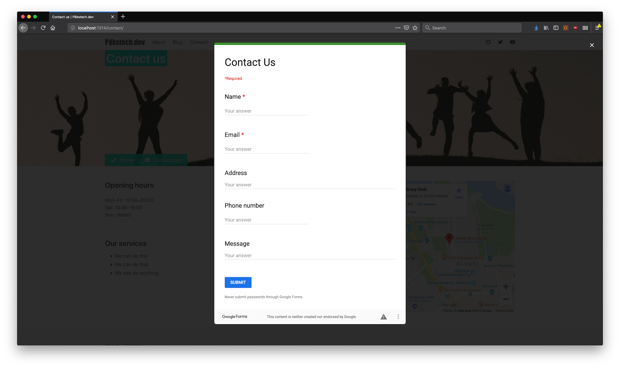
Modal contact form opened
Conclusion
Now you know how to create single pages to your Hugo site. You also know how to specify special layouts for different pages with the layout parameter in the front matter. This should give you the tools to create pages that are specific to your site.
Read next in the Blog with Hugo series.
Previous post
Improve Your Git Workflow With Github Hub