Create a Single Post Template in Hugo
Janne Kemppainen |In this post we will create a template for single blog posts on our Hugo blog. The end result will be a clean and simple page with support for a featured image. It will also show the author, an author image, publish date and the estimated reading time.
Make it easier to find the posts
At the moment we don’t have any way to navigate to single posts from our homepage without knowing the exact urls of our posts. Let’s fix this quickly by listing the child pages on our blog section.
You have probably already noticed that the layouts/_default/ directory already contains a file called list.html. This is the template file for list pages such as the /blog index that would display all the posts. The _default directory is the last directory in the Hugo lookup order so if there is no other applicable template then Hugo uses the default one.
Open the list.html file in your editor and add these lines:
{{ define "main" }}
<div class="container">
    <div class="section">
        <div class="content">
            <h1>{{ .Title }}</h1>
            {{ .Content }}
            {{ range .Pages }}
            <a href="{{ .Permalink }}">{{ .Title }}</a>
            {{ end }}
        </div>
    </div>
</div>
{{ end }}
Now we have a general template for list type pages which helps us check that everything works as intended and makes it easier to navigate the website while it’s under development. If you now check the http://localhost:1313/blog page you should see your first blog post listed there. Hugo also tried to do something intelligent with the page title by changing it to “Blogs”. As this isn’t really what we want go to the root directory of your site and create an index page for the blog post list.
>> hugo new blog/_index.mdThe title of the blog page should immediately change to “Blog” without the plural ’s’. As we also have the {{ .Content }} block in our template any text that you write in the index file will be displayed on the page before the blog post links. Remove the draft: true line from the front matter of the file.
The links are added by looping through the .Pages variable that contains a list of all child pages for /blog. Inside the range loop the current context (the dot) is always an individual page so we can use the page variables to customize each link. I encourage you to take a look at the available page variables.
Create a blog post with test content
If you haven’t followed every post in this series yoy probably won’t have a sample blog post for testing purposes so create one using the hugo new command (make sure you are at the root directory of your website).
>> hugo new blog/2019/lorem-ipsum.mdEdit the title and description in the front matter:
---
title: "This Post is Full of Lorem Ipsum"
date: 2019-03-20T18:42:38+02:00
description: "This is a short description of the page"
draft: true
---
You can generate some dummy text with this lorem ipsum generator and paste it in the content section of the Markdown file. Add headings, lists, tables etc. as you like. In the sample below I have truncated the lorem ipsum parts.
Lorem ipsum dolor sit amet, consectetur...

## What is Lorem Ipsum?
In mollis cursus ligula, et venenatis neque maximus ut...

Vivamus ut tincidunt urna. Nam eu mollis dolor...

## In mollis cursus ligula
Etiam et ligula sit amet urna aliquam suscipit...

- Cras dui nulla,
- ornare eget fermentum quis,
- accumsan vitae purus.

Nam eget pharetra arcu. Cras dui nulla, ornare eget...

### Nullam a risus maximus
Fusce facilisis non ante quis blandit...

### Donec vel accumsan justo
Maecenas eu libero ac justo tempor pellentesque...
Create a single page template
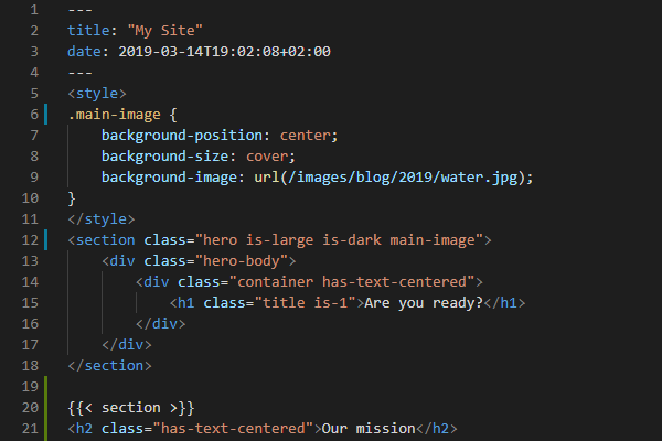
Create the single post template layouts/blog/single.html inside your theme. This is higher in the lookup order compared to the single.html file in the _default directory so we don’t need to do any complicated logic inside the layout file to determine the type of each page to add the correct items. Let’s start again by defining the main block and adding article tags inside a section:
{{ define "main" }}
<section class="section">
  <article>
  </article>
</section>
{{ end }}
Basic layout
I wanted to go for a clean look with a relatively narrow maximum width for the article content. To achieve this we will be needing a small CSS helper class to limit the maximum width of the text column. I opted to go for a width of 800 pixels so I added the following CSS to style.css:
.max-800px {
    max-width: 800px;
}
Next we need to create a new columns container with a single column. We want the column to be centered and we need to also use the CSS helper class to limit the width. Add the following inside the article tags:
<div class="columns is-centered">
  <div class="column max-800px">
  </div>
</div>
Now we are ready to add a title and content to the article:
<div class="columns is-centered">
  <div class="column max-800px">
    <h1 class="title is-1">{{ .Title }}</h1>
    <div class="content">
      {{ .Content }}
    </div>
  </div>
</div>
From the blog list page you should be able to navigate to the single post so go now to check how it looks. If you think that the title is too large you can change the title is-1 class to some other value such as is-2 or is-3.
The page should now look something like this:
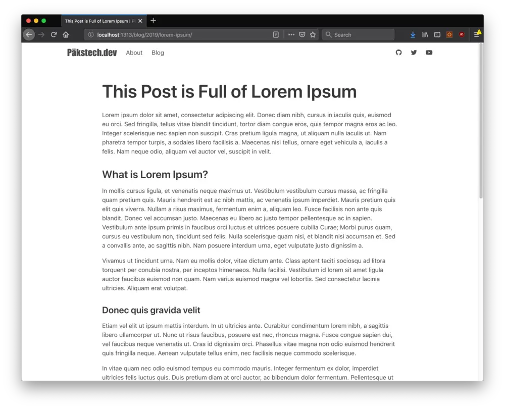
Sample page rendered
Post metadata and author image
Next add meta information below the post title to show the author, publication date and the estimated reading time.
This is optional but if you want to show an image of yourself on each blog post then add an image to the static/images directory and modify the site parameters in config.toml to point to it. For now we will only support one author per site.
[params]
    author = "Janne Kemppainen"
    authorImage = "/images/janne.jpg"
Now open the style.css file again and add the following:
.author-image {
    object-fit: cover;
    border-radius: 50%;
    width: 48px;
    height: 48px;
}
This piece of CSS will make the image round and size it to 48 by 48 pixels despite the original image dimensions and without stretching it awkwardly. If the source image is not square the longer edge will be cropped. For optimal performance it is recommended that you resize your original image to this size.
Now we can add code to the single.html template. Add the highlighted lines:
<div class="column max-800px">
  <h1 class="title is-1">{{ .Title }}</h1>
  <div class="title subtitle heading is-6">
    <div class="columns is-vcentered is-mobile">
      {{ with .Site.Params.authorImage }}
      <div class="column is-narrow">
        <img src="{{ . }}" class="author-image">
      </div>
      {{ end }}
      <div class="column">
        <p>{{ .Site.Params.Author }}</p>
        <p><time>{{ .PublishDate.Format "January 2, 2006" }}</time> |
            {{ .ReadingTime }} {{ if eq .ReadingTime 1 }} minute {{ else }} minutes {{ end }}</p>
      </div>
    </div>
  </div>
  <div class="content">
    {{ .Content }}
  </div>
</div>
What we did here is that we added a subtitle div under the title, changed it to a heading which made the text capitalized and reduced the size with is-6. Inside we put a columns container with the vertical centering modifier. The is-mobile class prevents the columns from wrapping so that the image and the text stay on the same line on all screen sizes.
The first column is optional and only added if the authorImage parameter has been set in the configuration. It has the is-narrow class which causes it to take only the minimum space that it needs. The parameter value is the current context so it can be inserted as the source attribute using a dot. The img element uses the author-image CSS class that we defined above.
The author and post information is another column. The author name is fetched from the site configurations and the publish date from the front matter of the blog post. The publish date is formatted with the .Format function which takes the desired date format as a parameter.
Hugo calculates the estimated reading time automatically based on the amount of words in your article and this estimate is available through the .ReadingTime variable. The value is given in minutes and we can select the singular or plural form of the time unit with a simple if else satement. If reading time is equal to one insert minute, and insert minutes otherwise.
To check for equality we had to use the eq function which takes the values to be compared as parameters. All available comparisons are listed below:
eq ARG1 ARG2equalgt ARG1 ARG2greater thanlt ARG1 ARG2less thanle ARG1 ARG2less than or equalge ARG1 ARG2greater than or equalne ARG1 ARG2not equal
The title section should now look like this:
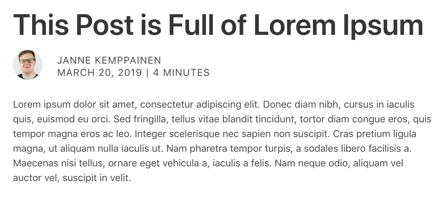
Title with author information, publish date and estimated reading time
Featured image
Next we’ll add a featured image to the post. You can go to Unsplash and download any one of the royalty free images you wish. I selected a photo of grassy hills. Save the image to the static directory at the project root. Don’t place the image in the static directory of your theme because it’s not a static asset of the theme but specific to a single post. You can use the same naming convention that I’m using (static/images/blog/{year}/{month}/{imagename}). For example static/images/blog/2019/03/fields.jpg.
Next we need to add the image reference to the blog post front matter. Do you still remember the Twitter and Open Graph card meta components that we added to the page head? Now we have an opportunity to kill two flies with one slap. You might remember the internal social sharing card templates use the parameter images to add a list of images to the page meta information. We can use the same variable for our featured image so it’ll be automatically shown when the page link is shared on social media.
The images parameter needs to be a list, and we only need one element inside it. There are two ways to create a list in YAML so you can use either one of these options:
Option 1
images:
  - /images/blog/03/fields.jpg
Note that indentation matters here.
Option 2
images: ["/images/blog/03/fields.jpg"]Note that the image path should not contain static as that is just the directory where Hugo fetches the static content from. Next add this piece of code after the subtitle div end tag and before the content div.
{{ with .Params.images }}
  <figure class="title-image">
    <img src="{{ index . 0 }}" alt="">
  </figure>
{{ end }}
This code uses the images parameter that we just defined. If it doesn’t exist then Hugo won’t add any of the code inside the with statement. The current context inside the blog is the value of the parameter which in this case is a list of strings. The index function takes this list and the index of the desired element as parameters and returns the value. Because list indexing starts from zero we need to use 0 to get the first element.
If you now check the blog post on the browser you should see that your image has appeared between the page title and the content. However, the blog text starts a bit too close to the content. That is why the figure element included the title-image class.
.title-image {
    padding-bottom: 2em;
}
Add the CSS above to style.css to separate the title image a little from the body of the article.
Categories
Categories is one of the two default taxonomies in Hugo (the other one is tags). Taxonomies are logical relationships between the website content, and it is possible to configure custom taxonomies. You can add categories to single posts by defining the categories variable. This makes it possible to create list pages that show posts which belong to a certain category. Add some categories to the front matter of your blog post:
categories:
  - Web development
  - Blogging
If you want to use the other list format remember to separate the items with a comma.
Let’s add the categories to the right side of the author and date information. The added lines are highlighted in the code below:
<div class="title subtitle heading is-6">
  <div class="columns is-vcentered">
    <div class="column">
      <div class="columns is-vcentered is-mobile">
        {{ with .Site.Params.authorImage }}
        <div class="column is-narrow">
          <img src="{{ . }}" class="author-image">
        </div>
        {{ end }}
        <div class="column">
          <p>{{ .Site.Params.Author }}</p>
          <p><time>{{ .PublishDate.Format "January 2, 2006" }}</time> |
              {{ .ReadingTime }} {{ if eq .ReadingTime 1 }} minute {{ else }} minutes {{ end }}</p>
        </div>
      </div>
    </div>
    <div class="column">
      {{ range $idx, $category := .Params.categories }}
      {{- if ne $idx 0 }}, {{ end }}<a href="{{ "categories/" | relURL }}{{ $category | urlize }}">{{ $category }}</a>
      {{- end }}
    </div>
  </div>
</div>
Here we placed the original columns element inside a column of another columns container. In theory we could have just added a new column inside the original columns container but because we have the is-mobile class defined the categories wouldn’t wrap to the next line on mobile devices. With this solution the author image and name stay next to each other but the categories will drop below them on mobile.
The code loops through the categories parameter if it exists by index and value. The category links are built manually by appending the urlized version of the category to the relative url of the categories list page.
This code also separates the categories by a comma and space. The if clause inserts the comma and space only if it is not the first item. The two hyphens inside the curly braces are critical for this to work as they eat away all whitespace before them in the loop. This places the commas right after the previous word without awkward spacing. Try removing one and see how it affects the list and the generated HTML source.
In this code there are also two examples of the usage of Go Pipes. In the first part the string “categories/” is passed to the relURL function which in this case only adds a single / to the URL but if our site had a different baseURL such as https://example.com/hugo/ it would add /hugo/ instead. The second part uses the local variable $category and passes it to the urlize function which transforms the string to a URL safe version. For example “Web development” becomes “web-development” which is also the form that Hugo uses for the single category pages.
And what’s really cool is that the categories already work! If you click a category you’ll notice that there is a page for that category which lists all the related posts. That is because we created the default list page and Hugo is also using it for taxonomy pages. You can even go to (http://localhost:1313/categories/) to see all available categories.
Previous and next post links
Blogs often have links to the next and the previous blog post so we’ll do that too. Hugo provides the variables .PrevInSection and .NextInSection which link to the previous and next page objects, respectively. Therefore adding the links is rather straight forward. Add this new section after the section that contains the article.
<section class="section">
  <div class="columns is-centered">
    <div class="column max-800px">
      <div class="columns is-mobile">
        <div class="column has-text-left">
          {{ with .PrevInSection }}
          <p>Previous post</p>
          <a href="{{ .Permalink }}">{{ .Title }}</a>
          {{ end }}
        </div>
        <div class="column has-text-right">
          {{ with .NextInSection }}
          <p>Next post</p>
          <a href="{{ .Permalink }}">{{ .Title }}</a>
        {{ end }}
        </div>
      </div>
    </div>
  </div>
</section>
To align the links in the same way as the main content of the page we can use the same trick with columns as earlier. Inside the main column we’ll put another columns container with the is-mobile class which makes sure that the columns stay next to each other even on mobile. Each column takes half of the available space and the text is aligned to the left or right with the has-text-left and has-text-right classes from Bulma.
The links are added conditionally depending on whether the .PrevInSection and .NextInSection are available. As these are page variables we can use all the data that is available for normal pages such as the permalink and title.
If you only have one post in your blog then nothing seems to have changed. Use the hugo new command to create new blog posts and see how the links appear after the articles. Try navigating between blog posts to see that they work correctly.
Conclusion
The final result should look like in the image below. We started from pretty much nothing and now we have a quite elegant looking template for blog posts.
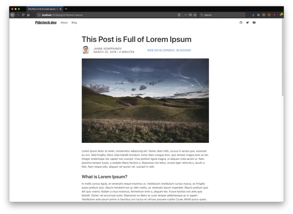
Final result
This wraps it up for this time. Next time we will create a template for generic pages such as “About” or “Contact us”.
Read next in the Blog with Hugo series.
Previous post
Create a Layout for Your Hugo Theme