Create a Layout for Your Hugo Theme
Janne Kemppainen |Last time we finally started creating our own theme and we were able to render something on the home page. We also created a template for the page head so that our pages will always contain the necessary metadata and information for social sharing. Next we’re going to create the basic layout for our page.
In this post we will add some CSS styling to organize the page layout as well as put in the basic building blocks of our site such as the header and the footer. To make things easier we will be using a CSS framework called Bulma. This will greatly reduce the amount of CSS that we need to write.
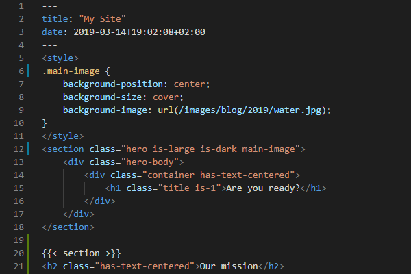
Our final result will look like this:
Edit head
To add Bulma to the page add the following style sheet to the head section of your page inside the head.html partial that we created last time.
<link rel="stylesheet" href="https://cdnjs.cloudflare.com/ajax/libs/bulma/0.7.4/css/bulma.min.css">This will make the browser download the CSS file from a content delivery network. If you want you can also manually download the CSS file to the static/css directory and link to the local copy with:
<link rel="stylesheet" href="{{ absURL "css/bulma.min.css" }}">We will also need Font Awesome so include the following:
<link rel="stylesheet" href="https://use.fontawesome.com/releases/v5.7.2/css/all.css" integrity="sha384-fnmOCqbTlWIlj8LyTjo7mOUStjsKC4pOpQbqyi7RrhN7udi9RwhKkMHpvLbHG9Sr" crossorigin="anonymous">Finally, we will be also needing jQuery:
<script src="https://ajax.googleapis.com/ajax/libs/jquery/3.3.1/jquery.min.js"></script>Add navigation
Currently our index page contains only the content from the _index.md Markdown file. Now let’s add a navbar which will be displayed on every page.
Take a look at the layouts/_default/baseof.html file again:
<!DOCTYPE html>
<html lang="{{ .Site.LanguageCode }}">
    {{- partial "head.html" . -}}
    <body>
        {{- partial "header.html" . -}}
        <main>
        {{- block "main" . }}{{- end }}
        </main>
        {{- partial "footer.html" . -}}
    </body>
</html>
As you might remember this template fetches content from partial HTML files. These files can be found from the layouts/partials/ directory.
We will use the Bulma navbar so go check out the documentation so that you understand what all of the CSS classes mean.
Let’s create the header partial file so open layouts/partials/header.html for editing and add the following code:
<header>
    <nav class="navbar" role="navigation">
        <div class="container">
            <div class="navbar-brand">
                <a href="/" title="home" class="navbar-item">
                    <span class="logo"><h1>{{ .Site.Title }}</h1></span>
                </a>
                {{ range .Site.Menus.social }}
                <a href="{{ .URL }}" class="navbar-item is-hidden-desktop" title="{{ .Name }}"><span
                        class="icon">{{ .Pre }}</span></a>
                {{ end }}
                <a role="button" class="navbar-burger" aria-label="menu" aria-expanded="false">
                    <span aria-hidden="true"></span>
                    <span aria-hidden="true"></span>
                    <span aria-hidden="true"></span>
                </a>
            </div>
            <div class="navbar-menu">
                <div class="navbar-start">
                    {{ range .Site.Menus.main }}
                    <a href="{{ .URL }}" class="navbar-item">{{ .Name }}</a>
                    {{ end }}
                </div>
                <div class="navbar-end">
                    {{ range .Site.Menus.social }}
                    <a href="{{ .URL }}" class="navbar-item is-hidden-touch" title="{{ .Name }}"><span
                            class="icon">{{ .Pre }}</span></a>
                    {{ end }}
                </div>
            </div>
        </div>
    </nav>
    <script>
        $(document).ready(function () {
            $(".navbar-burger").click(function () {
                $(".navbar-burger").toggleClass("is-active");
                $(".navbar-menu").toggleClass("is-active");
            })
        })
    </script>
</header>
That was quite a bit of code so let’s chew it bit by bit. A simplified structure of the file is like this:
header
    navbar
        container
            navbar-brand
                navbar-item
                    logo
                navbar-item
                navbar-burger
            navbar-menu
                navbar-start
                    navbar-item
                    navbar-item
                navbar-end
                    navbar-item
                    navbar-item
    script
Everything in the header is naturally enclosed within the <header> tags. Next is the navbar element with the navbar Bulma class. Inside the navbar there is a div with the container class. This limits the width of the navbar content so that the logo and links don’t start from the edge of the page on larger screens. You can omit this div if you want the logo to always be at the edge.
The first element of the container is the navbar-brand. This is the left side of the navigation bar that contains the site logo and is always visible. It contains navbar-items which in this case are the site title and links to social media. The social media icons have additionally the is-hidden-desktop class which means that they will be visible on touch devices only. Finally there is the navbar-burger with some span elements. This might seem wierd but this structure is needed to render the hamburger icon properly so just copy it without questioning.
The second child of the container is the navbar-menu which is the right part of the menu that is visible on desktop and hidden on touch devices. It is again divided into two parts: navbar-start and navbar-end. The first one is the right part of the area after the logo and contains links from the main menu configuration which are added with the range loop. The second one contains another copy of the social icons but this time they are hidden on touch devices.
Finally there is a small piece of JavaScript (jQuery) which makes the hamburger icon work by expanding the menu on touch devices and small browser windows.
After saving the file you should now see a link to your home page with the title of your site. The value for the title is fetched from the config.toml file. You can add more entries to the header by adding them to the configuration file. The pages that you add to the navigation are not generated automatically so make sure that you have created them if you want your links to work. (Right now we don’t have a single page template.)
You can add new navigation links by adding entries to the config.toml file like this:
[[menu.main]]
  name = "About"
  url = "/about"

[[menu.main]]
  name = "Blog"
  url = "/blog"
You may need to restart the Hugo server to see the changes but now the header should contain links that direct the user to the about and blog pages.
Adding new social icons is also easy. Find the brand that you want to add from the Font Awesome website and add the small piece of html to the pre value of the social link. Here are some examples:
[[menu.social]]
    name = "GitHub"
    url = "https://github.com/pakstech"
    pre = "<i class='fab fa-github'></i>"

[[menu.social]]
    name = "YouTube"
    url = "https://www.youtube.com/channel/UCg_e3UBPs-BxPo_jVg1gGOQ"
    pre = "<i class='fab fa-youtube'></i>"

[[menu.social]]
    name = "Twitter"
    url = "https://twitter.com/pakstech"
    pre = "<i class='fab fa-twitter'></i>"
Add footer
To add the footer open the layouts/partials/footer.html file inside your theme and add the following content:
<footer class="footer">
    <div class="container">
        <div class="columns has-text-centered">
            {{ range .Site.Menus.footer }}
            <div class="column is-narrow">
                <a href="{{ .URL }}" class="">{{ .Name }}</a>
            </div>
            {{ end }}
        </div>
    </div>
</footer>
This time we are using the footer class from Bulma. It can contain any HTML so we put a container to limit the width of the footer section on larger screens. Inside the container there is a div with the class columns. You can read more about Bulma columns here. Put simply, each item inside the columns container is its own column that takes just the minimum width it needs. On mobile screens the columns will be stacked on top of each other.
Edit the site configuration file and add all the links you want to be shown on the footer:
[[menu.footer]]
  name = "About"
  url = "/about"

[[menu.footer]]
  name = "Privacy"
  url = "/privacy"
The bottom of your page should now have all your footer links as list items.
Make the site content render properly
Because we are using Bulma the sample heading and the content on the front page seem to have identical styling. This is because Bulma requires explicit styling using classes. Therefore a h1 heading won’t look like a title unless it has the title class and even the size is independent of the HTML tag and can be set with is-1, is-2, is-3 (default), etc.
Lucky for us Bulma has introduced the content class which makes the HTML tags render with default values without having to specify the classes. Therefore we can keep using Markdown for headings instead of having to write them with HTML.
So edit the layouts/index.html file to look like the code below and the content should now be shown properly. Add some more content to your front page by editing the _index.md file of your site.
{{ define "main" }}
<div class="container">
    <div class="section">
        <div class="content">
            {{ .Content }}
        </div>
    </div>
</div>
{{ end }}
In addition to the content class I added a container to limit the content width on larger screens as it isn’t really pleasing to read text that is really wide. I also added a section which gives some padding around the content so that the text wont start from the edge of the screen on touch devices.
Add custom styling
Now it’s time to get our hands dirty with some CSS. Create a general style sheet style.css inside the static/css directory. Add the following style sheet references after the Bulma CSS in the head.html file:
<link rel="stylesheet" href="{{ "css/style.css" | relURL }}" />Style the logo text
Here I’ll give you all the artistic freedom to style the site logo text how you see best fit. Just for the sake of this example I’ll keep it simple and just change the font, increase the size a little and make the text bold:
.logo h1 {
    font-family: Impact, Haettenschweiler, 'Arial Narrow Bold', sans-serif;
    font-size: 1.5em;
}
While we’re at it I think I could change the site title too so let’s use something that is less general in the config.toml file:
title = "Päkstech.dev"Make sure that the footer is at the bottom of the page
If you look at the front page of your site (http://localhost:1313/) you’ll probably notice that your content is not tall enough to push the footer all the way down to the bottom of the page. We’ll fix this with CSS flexbox.
Open the style.css file and set the body element to be a flex container with a minimum height of the viewport:
body {
    display: flex;
    flex-direction: column;
    min-height: 100vh;
}
The body element contains three child elements: header, main and footer. We want the main content to expand to fill any unused space like so:
main {
    flex: 1;
}
The flex property is a shorthand for defining flex-grow, flex-shrink and flex-basis, the last two values are optional. The default value for flex-grow is zero which means that the element won’t take more space than it needs. On the other hand the default for flex-shrink is one which means that elements try to shrink when there is not enough space to accommodate all elements in their full size.
The end result here is that the header and footer wont increase in height while the main block is forced to take up any leftover space if it doesn’t have enough content to make the page fill the whole vieport height.
Conclusion
Our site is slowly starting to take shape and we have a basic navigation. We also got started with the CSS framework Bulma. Next time we are going to create a template for single blog posts.
Read next in the Blog with Hugo series.
Previous post
Let's Create a New Hugo Theme